4Culture Public Art
A redesign of how King County digitally connects its citizens with public art
Overview
4Culture is a government body in King County, Washington, that provides funding and support for the cultural work that makes King County vibrant. Their Public Art department commissions artwork for shared public space throughout King County and stewards the King County Public Art Collection.
4Culture partnered with me to better understand:
Who is the audience visiting the Public Art pages of the 4Culture website?
How much of the public art collection do these visitors want to see on the website, and how do they want to experience it?
How can we improve the website based on our findings from the above inquiries?
Research
Interviews
4Culture aims to serve the entire population of King County. As such, I needed to hear from people who had visited the website, but also those that hadn’t yet explored the site. I set out to interview:
4Culture Public Art staff members
Visitors to the Public Art pages, through a pop-up invitation to share thoughts on the website
Existing website users, identified by the Public Art staff that had come in contact with them
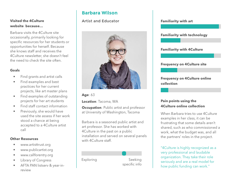
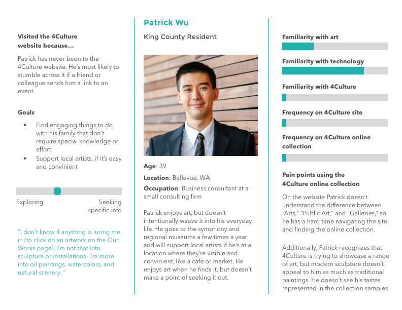
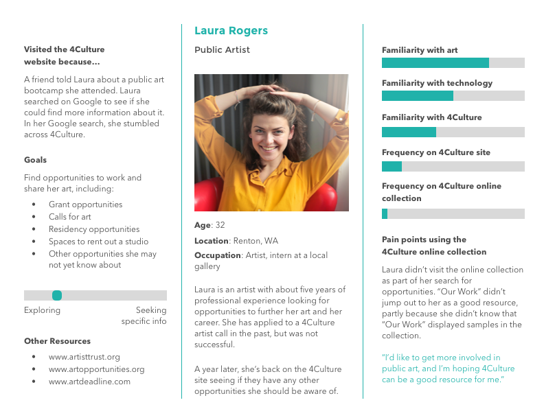
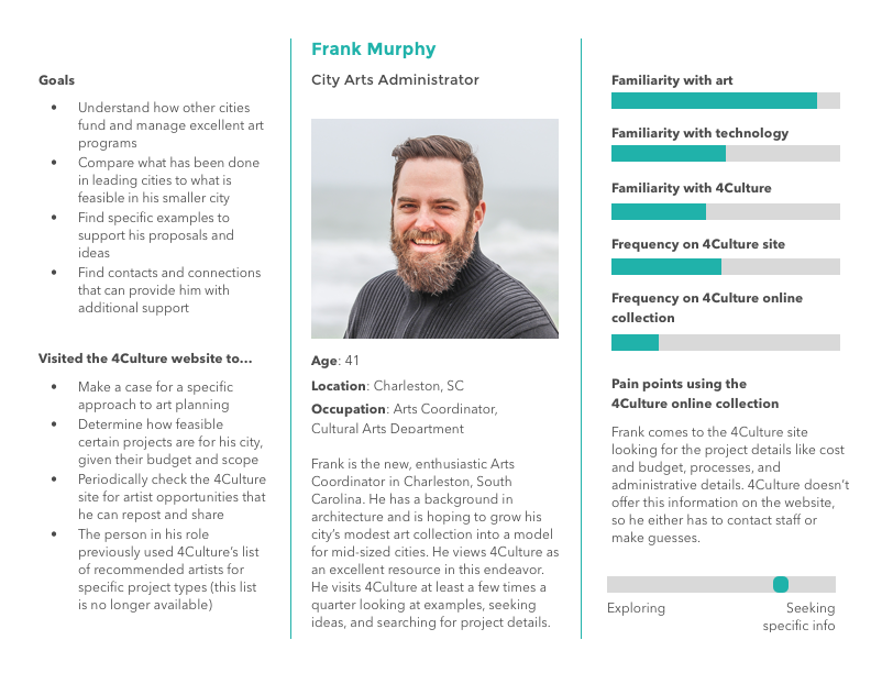
I interviewed over 30 individuals and was able to identify clear patterns between the different types of individuals I spoke with. I grouped them into four personas, which we referenced whenever we faced a decision about how to display information on the website.
The interviews and discussions with everyone from art administrators to people grabbing coffee at a coffee shop revealed a few straightforward takeaways:
People appreciated the rich images on the site
Those working in the art space appreciated seeing project partners on the pages that showcased art, but wanted to know 4Culture’s role in the project
Artists and educators were ruffled by inconsistent or nonexistent image credits/citations
But the interviews also raised more complex questions, such as…
4Culture stewards the King County public art collection, comprised of thousands of public art pieces. Do those pieces all need to be represented online, or is just a sample enough? How big of a sample is enough?
How should the art be organized online?
Is the 4Culture website about the organization 4Culture, or about the art that 4Culture stewards?
“There’s a certain duty in making public art, in that you need to make sure it’s available and accessible to the public. It’s part of project care, just like cleaning it.”
Domain Analysis
4Culture is not alone in their work. I wanted to learn what other city and county art organizations were tackling these challenges. In addition to interviews, I reviewed the content, presentation, structure, and best practices of other websites showcasing public art. These findings were presented in a comparative analysis report and provided ideas and inspiration for how we could solve some of the challenges faced by 4Culture website users.
Planning
As with any project, we had to work within the organization’s constraints. While 4Culture loved the idea of representing all the art on the website, there wasn’t the staff or bandwidth to do so. However, they recognized the opportunity to greatly expand the number of works represented on the website —only a handlful of the thousands of art pieces in the collection—to include a much broader and diverse subset of the collection.
We also needed to accommodate peoples’ different purposes and needs for exploring the art collection. Our persona Patrick was a casual and accidental explorer, whereas our persona Barbara visited the site with a specific intention of researching a particular artist. Our designs needed to offer ways for both of them to gain the knowledge and experience they sought.
I began exploring wireframes—some inspired by my comparative analysis exercise, some inspired by user suggestions, and some born out of my own imagination—that would accommodate the needs of our various personas while still being clean, navigable, and leveraging the beautiful images already on the site that users expressed appreciation for.
Design
With our newfound user data, I began redesigning the webpages through the below process:
Creating grayscale prototypes
Testing prototypes with users
Creating full scale, clickable mockups
Testing mockups with users
Finalizing and creating workflows to implement the designs
The design we landed on expanded the number of art presented on the site, but in a way that 4Culture could gradually increase the number over time. It provided a map for explorers looking for art in their area, and a complete list of works for those using the site for research. Because the 4Culture site is a responsive site, I provided mockups for desktop, tablet, and mobile views.
Results and Learning
4Culture was happy with the research and the designs that flowed from them. However, it would take a while for them to build the staff necessary to execute the changes. (They’ve since hired an intern who is working on this!) In order to document our decisions about various design elements—such as how to display a list of the entire collection—I created a Design Decisions document that outlined our thinking on each of the major decisions we made. It was helpful for me to put our thoughts in writing, and will hopefully help onboard new staff as they grow and improve the website. I think a document like this will be helpful in other projects that span a relatively long period.
As always, I loved working with a team that was passionate about their work and wanted to get the design “right”—that didn’t mean that there was only one way of doing it, but it did mean that their users had a voice and saw their feedback in our final design.
The redesigned 4Culture Public Art pages will be launched in the near future. For another, smaller 4Culture project I worked on, see the 4Culture Heritage page redesign.